26 February 2021
HAB: How long did the development of the HAB’s new corporate design take, from the initial concept to the final implementation? What challenges did you face?
Simone Schöler: The process began in May 2017 with several intensive day-long workshops. Together with members of various HAB departments we came up with an idea that would serve as the conceptual framework for the HAB’s new corporate design. The actual design was presented to the entire team in the Augusteerhalle in late August. Work was completed with the handover of the design handbook in November.
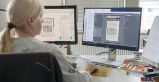
We took part in a number of discussions during our visits to Wolfenbüttel and got a good impression of the library. Alongside the results of the workshops, these talks played a fundamental role in the design’s development. The new look is especially aimed at highlighting the HAB’s healthy reputation as an internationally recognised place of research. That is why it was important for us not only to ask about the library’s history but also – and most importantly – to develop an appropriate formal language that can locate this history in the present and future, while keeping in mind the next generation coming through in the research community. It was soon determined that the website should more clearly communicate the HAB’s multifaceted nature as a research institute, tourist attraction, museum space and location for cultural events. One of the challenges we faced was how we could focus equally on very different target groups consisting of day-trippers, postgraduate students, school groups and cultural audiences. The fact that we were able – working together with the public relations department, the management and a number of dedicated HAB employees – to develop an assortment of well-structured ways for these different target groups to access the website was one of the great successes of our collaborative efforts.
HAB: Why is a new corporate design so important for the HAB?
Simone Schöler: Over the years, a lack of clarity had managed to find its way into the HAB’s public image. Many different departments with many different needs had made use of this image, leading to a lack of clear recognition value and graphic expressiveness. In particular, the website’s structure could no longer be described as user-friendly in all areas. It is of fundamental importance that the library and research centre can present itself in a well-structured manner that is clearly recognisable to international audiences. Only thus can the individual components – website, publications, exhibition posters, etc. – come together to create the proper image of diversity brought together ‘under one umbrella’.
HAB: What fonts does the new design concept employ and what are their advantages?
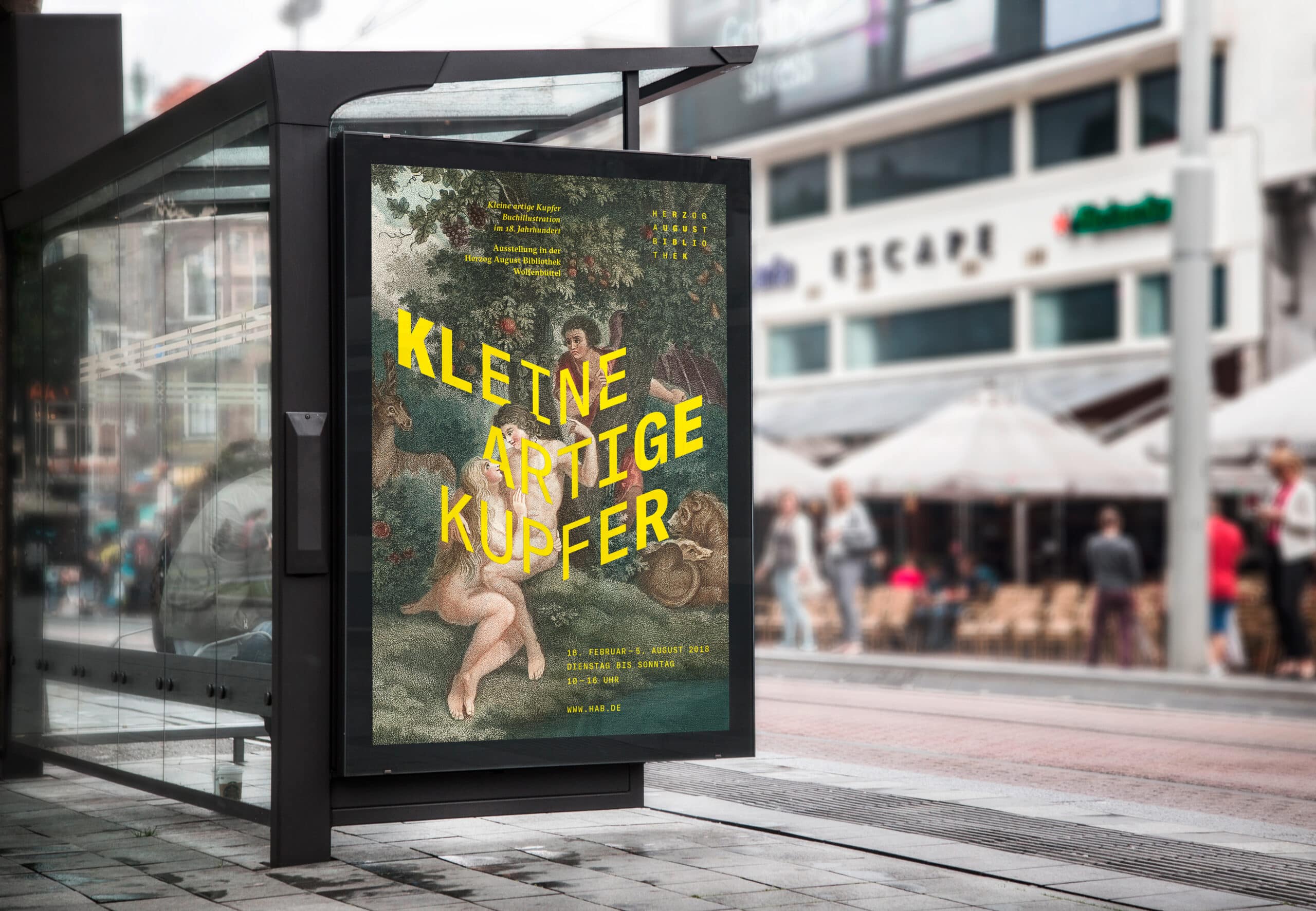
Simone Schöler: We selected two fonts created by an internationally renowned design firm. The Swiss font foundry Grilli Type designs high-quality fonts that intelligently combine the formal language of historical designs with contemporary styles. GT America for headlines and informational texts combines excellent Swiss typography with details taken from the American postmodern. For running text and title pages appearing in books, GT Sectra allows readers to experience printing’s pioneering work and transforms this spirit into a distinctive contemporary design with a style of its own.
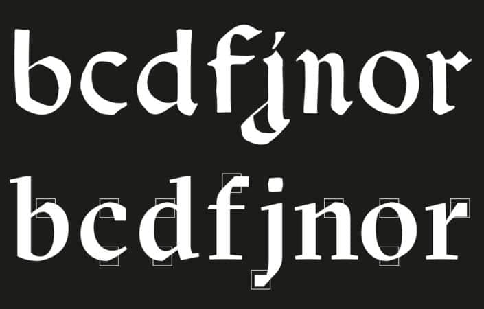
We believed our main task was to continue telling the story of the HAB and the origins of its treasury of knowledge, using a modern style. The Grilli fonts are the right choice for the job, as they augment a classical Antiqua design with contemporary details.
HAB: The new colours evoke a good many associations …
Simone Schöler: When we started our work on the new corporate identity, we made a number of forays through the library and exhibition rooms. Alongside the many black letters on a white background, we also discovered very colourful and vibrant book illustrations. We wanted to give visible expression to the intensity and verve evident in these examples of historical book art, which led us to play close attention to the use of colour.
HAB: The logo is now much more minimalistic and the letters have different weights. What was the idea behind this?
Simone Schöler: We gave the HAB logo an archival character reminiscent of a left-to-right, top-to-bottom classification system that reflects a library’s main task, which involves searching, finding and generating knowledge. The arrangement of the characters creates a recognisable image. The characters’ differing font weights direct the eye to the centre. Here the characters are weighted more heavily – as if viewed under a magnifying glass – becoming lighter out towards the edges.

HAB: What criteria do you believe were particularly relevant for the design of the new corporate identity?
Simone Schöler: The website’s new structure is intended to offer users two means of access. Firstly, they should be able to search specifically for certain content and information, which is facilitated by the clear main menu. Secondly, we had to make it possible for users without foreknowledge or specific questions in mind to discover the library and all its offerings. The pop-up menu for the ‘Research’, ‘Library’ and ‘Culture’ areas invites visitors to draw inspiration from the variety of offerings, while also providing them with a glimpse into the work carried out by the HAB.
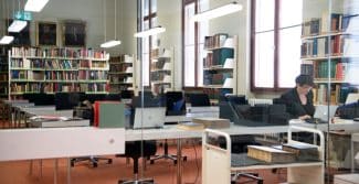
The Herzog August Bibliothek is a centre of knowledge catering to a wide range of interests. This is something the new corporate identity attempts to communicate in every aspect while at the same time displaying its appreciation for every visitor, be they a day-tripper or a fellowship holder. It should also show visitors that despite its overwhelmingly historical holdings, the HAB is a place of knowledge and cultural education with its eyes firmly set on the present and future.